
🎯 Animated Diagrams, Sharper AI, and Laser-Focused Presentation on Jeda.ai
This release is not about “small tweaks.” It’s about making Jeda.ai the place where online MBA programs and business consultants actually show how strategy moves, not just talk about it. If you run cohorts, lead executive education, or advise leadership teams, these upgrades are built to make your sessions clearer, more dynamic, and more convincing.
1. Sonnet 4.5 & Opus 4.5: Sharper Brains for Serious Work
Previously, Jeda.ai already shipped with Claude Sonnet 4 and Claude Opus 4 for high-stakes reasoning.
Now we’ve upgraded to:
✔️ Claude Sonnet 4.5
✔️ Claude Opus 4.5
What this really means for you:
✔️ Cleaner strategic narratives -
Turn messy notes into board-ready storylines: problem → options → trade-offs → recommendation.
✔️ Deeper case analysis -
Deconstruct Harvard-style cases, compare business models, or stress-test an expansion plan with stronger multi-step reasoning.
✔️ Better long-form outputs -
From investor memos to multi-slide lecture outlines, the models hold structure and nuance better across long flows.
For online MBA programs, this is ideal for:
✔️ Auto-drafting case summaries and teaching notes.
✔️ Creating better alternative scenarios for classroom debate.
✔️ Helping students generate better structured analysis frameworks, not just bullet noise.
Sonnet 4.5 and Opus 4.5 are the “brain upgrade” behind the visuals your cohort or client will see on the Jeda.ai canvas.
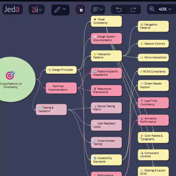
2. New Sticky Note Shapes: Circle & Oval for Visual Priority
Sticky notes are no longer just squares and rectangles. We’ve added, among many other shapes:
👉 Circle sticky notes
👉 Oval sticky notes
And you can drag to morph between circle and oval to find the perfect in-between.
Why this matters for consultants & educators:
👉 Visual hierarchy without saying a word -
Use circles for “core truths,” ovals for “supporting ideas,” and standard notes for granular tasks.
👉 Teaching patterns more clearly -
In an online MBA session:
- Circle = central thesis
- Oval = key drivers or risks
- Square = actions, owners, next steps
👉 Cleaner frameworks -
When mapping things like SWOT, 5 Forces, OKRs, or customer journeys, shape variation helps students and stakeholders instantly see what matters most.
This is the small visual change that makes complex boards readable at a glance on a screen share.
3. Animated Connectors: Show Movement, Not Just Structure
We previously introduced connector styling (thickness, solid/dotted/dashed lines, etc.) for mind maps, flowcharts, and diagrams.
Now we’ve unlocked something much more storytelling-friendly:
When a connector’s line type is dotted or dashed, a new Animation option appears when the connector and its adjacent sticky note are selected.
Turn Animation on and the connector becomes a moving, pulsing line.

What this is perfect for:
☑️ Explaining loops and cycles - Feedback loops in product growth.
☑️ PDCA cycles - Flywheels and recurring revenue motions.
☑️ Showing direction of impact - Instead of just saying “A influences B”, the animated connector shows the energy flowing.
☑️ Recording GIFs / loop videos for LMS or decks -
- Record a short clip of your animated diagram
- Drop it into your LMS, slide deck, or async lecture
- Students “feel” the system, not just read labels
For consultants, this is gold for explaining systems thinking, risk propagation, or operating model dynamics to leadership teams who don’t have time for a 30-page doc.
4. Laser Marker: Guide Attention Like a Live Studio Host
We’ve added a Laser Marker tool to the toolbar:
☑️ Pick any color (full color picker, no artificial limits)
☑️ Control thickness to match your presentation style
☑️ Click and draw → the line stays on screen for a few seconds, then disappears automatically
How this changes your online sessions:
☑️ You can “point” without polluting the canvas - No more drawing arrows you have to delete later. You highlight, explain, and the mark vanishes once it’s served its purpose.
☑️ Perfect for live lectures & workshops -
- Highlight one quadrant of a 2×2
- Trace a path through a customer journey
- Circle a KPI spike on a chart
Students track your thinking the same way they would follow a lecturer pacing in front of a physical whiteboard.
☑️ Less friction, more flow - You don’t break your narrative to clean up shapes. The laser cleans itself up.
For online MBA decision makers, this tool is a quiet upgrade that makes every live session feel more like a studio production and less like a static screen share.
5. Bug Fixes, UI/UX Improvements: Smoother for Real Courses & Clients
And of course, the boring but critical part:
- Bug fixes across canvas behavior and tools
- UI/UX refinements for smoother control panels, cleaner interactions, and more predictable behavior
What you get:
- Less time fighting the tool
- Fewer “wait, why did that move?” moments
- A platform you can trust for live consulting workshop, teaching, graded assignments, and client presentations without embarrassing surprises
What This Release Really Delivers for Consultants and Online MBA Programs
If we strip away the technicalities, this release gives you:
🫵 Smarter brains (Sonnet 4.5 / Opus 4.5) for serious reasoning
🫵 Clearer visuals (circle/oval notes + animated connectors) for presenting complex systems
🫵 Better live control (laser marker) to direct attention in remote rooms
🫵 Less drag from bugs and clunky interactions
Put simply:
Jeda.ai is making it easier to teach strategy, explain systems, and sell decisions in a way that people actually understand and remember.
Wrapping Up
If you’re running an online MBA, EMBA, or consulting practice and still juggling slides, stale whiteboards, docs, and five other tools, this is your cue to centralize the real work on one visual AI workspace.
Log in, try the new sticky notes, toggle connector animation, and run your next session with the laser marker turned on. Your cohorts, and your clients, will feel the upgrade.

